Type Design | Fall 2024A fresh masthead for The Huntington News
I was ecstatic to deliver Northeastern’s independent newspaper with a new masthead that was bold and clean to represent the journal.

The Old
The old Huntington News masthead had not been changed since the newspaper’s founding in 1926. While historic, the word-mark had bothered the editor in chief for some time, and she finally decided to change it.
We both agreed that the old masthead did not stand strong enough on the page, and needed qualities more akin to a confident typeface.

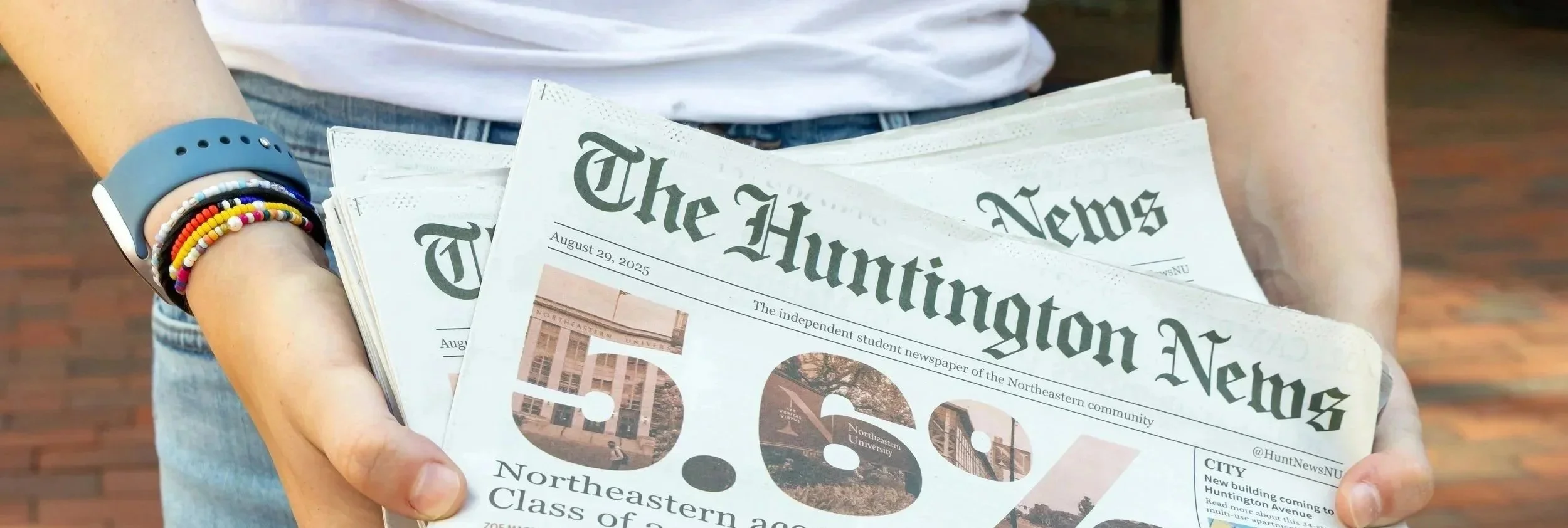
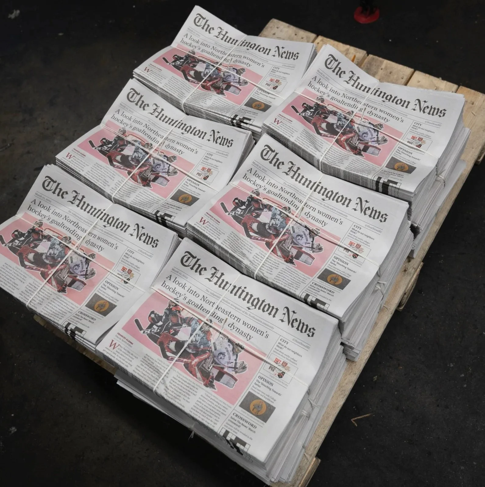
The NEW

This bolder, cleaner masthead stands more confidently on the page and on the screen, and is more representative of the journalistic integrity the Huntington News upholds.


TYPE COMPONENTS
While blackletter appears intricate, it consists of a rather straightforward system of shapes. Originally created with thick calligraphy pens, the components of black letter type is a consistent assortment of vertical and diagonal strokes and serifs.

The majority of the masthead is composed of the same 8 shapes. They form a modular system for consistent black letter type.

More Projects