Populace
Brand & Identity Design, Web-design | Spring 2024Populace is an organization from New York looking to build community in urban areas through disc-golf.
When Populace came to Scout (Northeastern’s student-led design firm), they were equipped with a logo and some disc designs, but were in need of a cohesive brand system and fresh new merchandise.


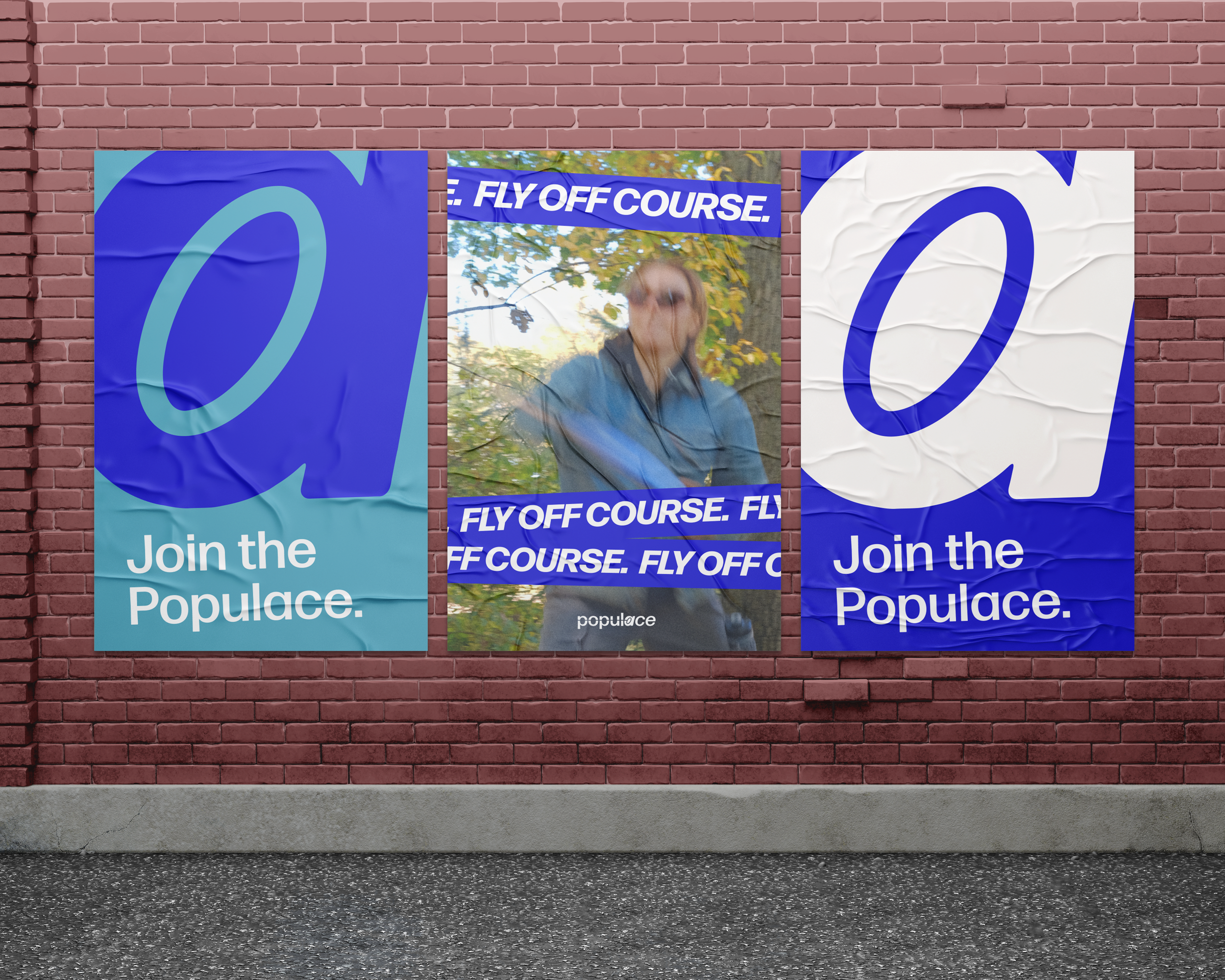
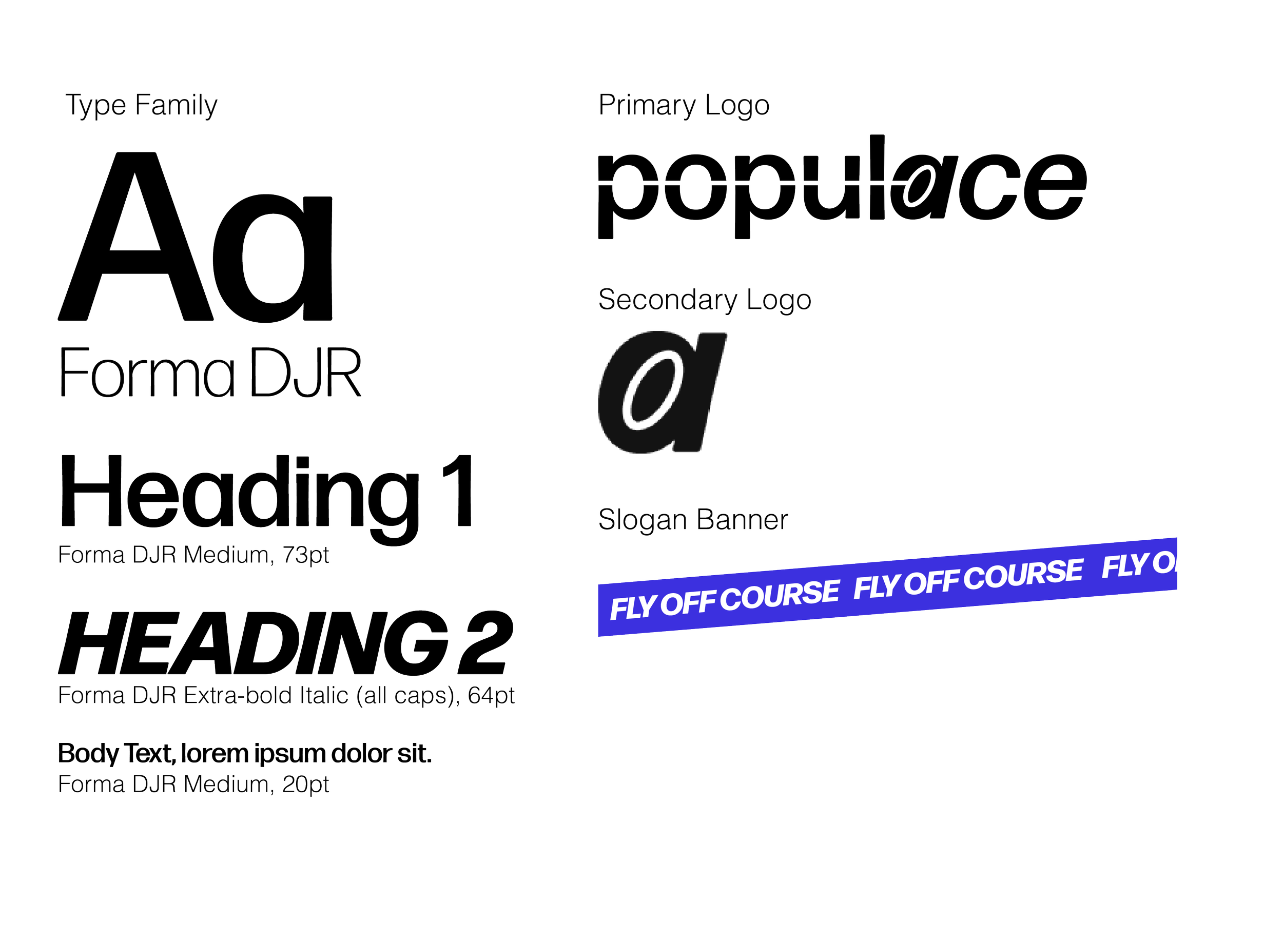
Branding Summary

Navy and white create a mature, sophisticated palette, allowing for the secondary colors to bring energy and life to the brand.
The comprehensive set of 6 colors gave Populace plenty of flexibility to continue to create graphics and develop their website after leaving Scout.


New Landing Page
Equipped with our thorough branding guidelines, we created a new landing page for the Populace website.
It serves to inform readers on sport basics, the mission of community through disc-golf, and links to merchandise availible for purchase.
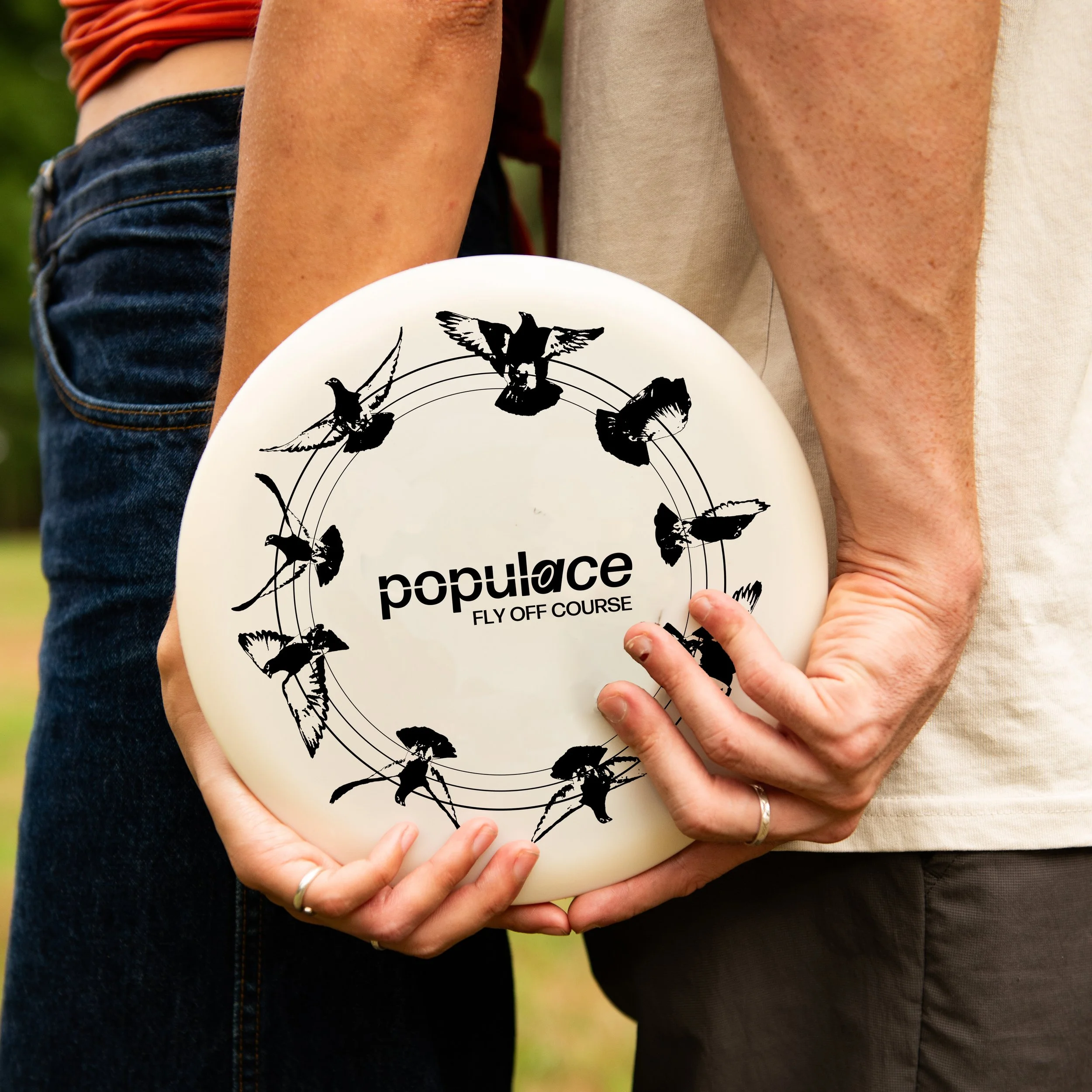
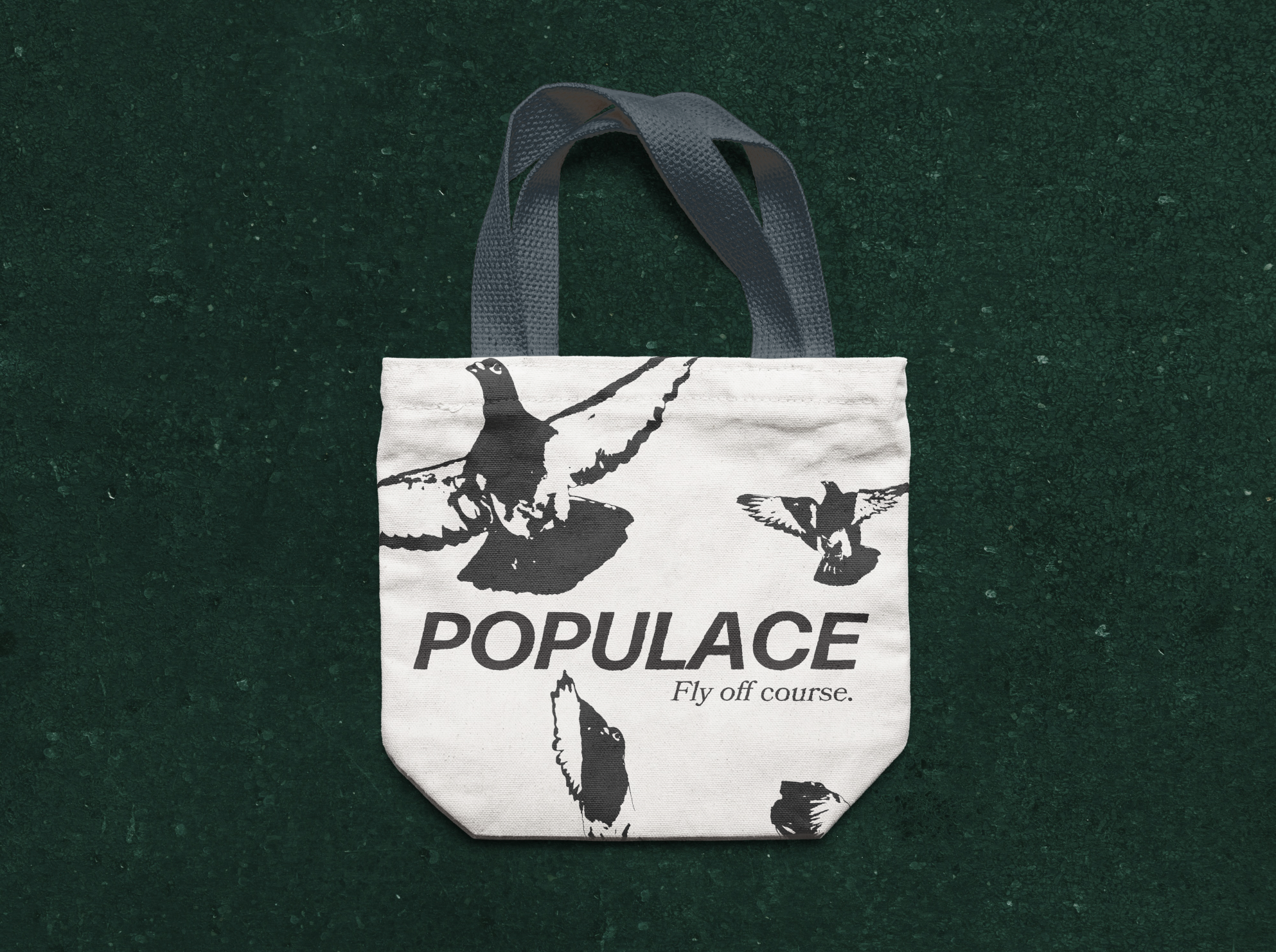
Art Bundle
The three graphic designers on the Populace team were each tasked with creating an art bundle illustration that flexed between a t-shirt, a tote, bag, a disc design, and a baseball cap.
I wanted to play with the slogan ‘fly off course’ and create a subtle nod to the organizations origins, New York City, with a flying pidgeon design.


More Projects
